Responsive Web Design – A Detailed Guide
This guide will help you understand everything about responsive web design. As we begin, let us first understand what responsive design is and what its importance is.
How Does Responsive Web Design Work?
The concept of responsive design encompasses the use of various screen sizes, platforms, and orientations to tailor the user’s experience. Layout flexibility, pictures, and media queries used judiciously are part of the process. The website should adjust its resolution, picture size, and scripting capabilities when switching from a laptop to an iPad. This should be done to take into account the user’s device settings.
For example, if a user has a VPN for iOS on their iPad, the website must not restrict its access to the site. This means that the website must be equipped to respond to user preferences automatically.
As a result, new gadgets would no longer be subject to separate design and development phases.
If you think of content as water and assume the phone is glass, laptop as a bottle, and tablet as a pot and pour it(content) from one device to another – the water remains the same, but the shape, environment, and view are changed as per the device. A responsive web design will optimize the water to fit well in each device.
Role Of Responsive Web Design
In web design, responsive design allows content to adapt to different screen and window sizes across the spectrum of devices.
Need For Responsive Web Design
Google recommends it- Responsive websites are easier to crawl into by the spiders and display the information.
Improved Local Search Rankings- If your site is well optimized in terms of responsiveness, naturally, it will be displayed higher in the search results.
Cost and time-efficient- You don’t have to set up different sites for mobile and desktop viewing.
Local speed is improved on mobiles- The loading time increases, so chances of people shifting to another site due to slow load time are decreased.
Seamless user experience- when the content on a site is well placed, spaced, designed, and easy to use, it gives user’s a good experience.
Increased Traffic From Mobile Users- with the advent of mobile phone usage while browsing and working, optimizing the site to be responsive has become essential.
Three Most Important Aspects Of Responsive Web Design
We have seen the role and need for responsive design. Now let us understand the significant factors that need responsive design on the internet.
1. Media Queries
It can be used in various ways, such as in combination with a page’s layout or as part of an application’s content. They also enable designers to create a variety of formats using the same HTML files by supplying templates according to the client’s preferences, such as the browser’s window size.
2. Web Browser
As websites can have a lot of photos, it’s crucial to make these graphics flow as well. The idea of liquid graphics is to communicate concepts at the largest size possible. Responsive web page designers don’t define the visual height and width in the code; instead, they let the browsers resize the images on a case-by-case basis while controlling their relative sizes with CSS. The process of accurately resizing photos is a remarkable and simple one.
3. Website interface (JavaScript, HTML, and CSS)
Nowadays, many mobile devices have a touchscreen, which necessitates considering the size of interactive elements inside interfaces. Aside from picture flexibility, native features like keyboards and drop-out menus should be tuned to give consumers a fantastic experience, whether on mobile or desktop.
Responsive vs. Adaptive Design
In a responsive website, content is displayed according to the size of the browser. A responsive site can be opened on your desktop, and the content will dynamically move according to the size of the browser window. This happens automatically on mobile phones. It will automatically determine how the content should be displayed in the available space.
Responsive design is easy. Being fluid, users can access the online world and enjoy it on their handheld devices, much like a large monitor. A responsive site requires a deep understanding of the end-users requirements and an appropriate perception of the site.
Adaptive design has multiple fixed layout sizes. When your site detects available space, it chooses the layout that best suits your screen. In other words, when you open a browser on your desktop, the site will choose the most appropriate layout for that screen size.
When you resize the browser, the design remains the same. Adaptive design can appear as a different layout than the desktop version. This may be because the designer picked a different layout for the mobile screen.
Adaptive design usually creates six variations for the six most frequent screen sizes of pixel sizes – 320, 480, 760, 960, 1200, and 1600.
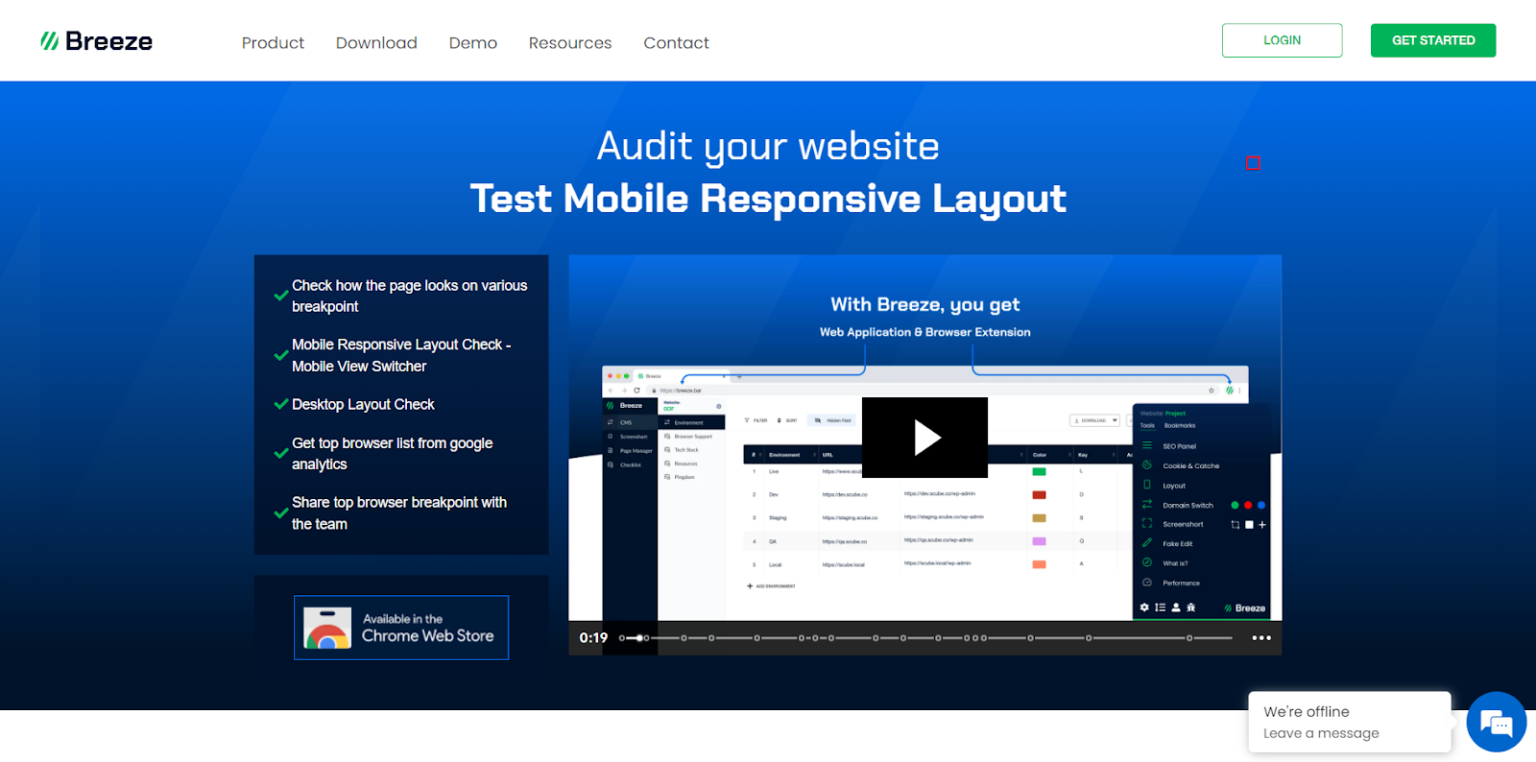
Easiest Way To Test Responsive Web Design
Testers, QAs, and graphic designers often face this challenge to test the responsive web design. They need to check if the changes are being reflected on the website if clients or decision-makers like them and act on their feedback from time to time.
This process can be quicker if we have a handy tool to check responsive web design.
And guess what?
We at Breeze have observed this need over the last 10 years of our web development journey and have made all of our lives easier with Breeze’s Chrome extension.
Along with other tools like SEO panel, Domain Switcher, and Live Edit –
Breeze has a Mobile View Switcher that lets you switch between desktop and mobile layout with a single click!
Isn’t that exciting?
That means you can see if your website is mobile responsive or not by clicking on the Breeze extension’s Layout button. And that’s all.
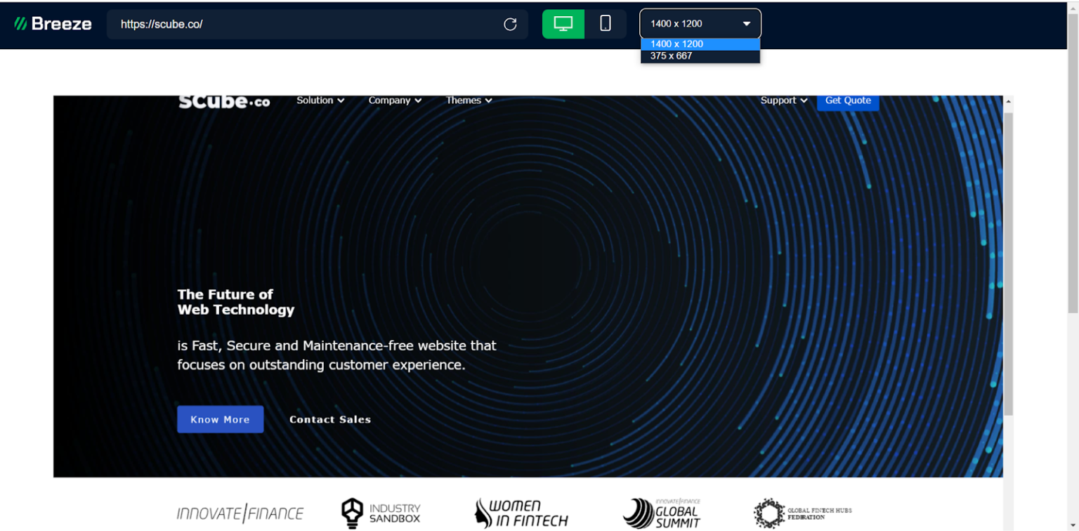
Click to check out Breeze’s Mobile View Switcher.
FAQ’s On Responsive Web Design
1. When was the first responsive website created?
The First Responsive Design Website: Audi (approximately 2002)
2. How to test website responsiveness?
You can use various tools to check responsiveness; one such tool is Breeze. It enables you to :
It enables you to: Check how the page looks on the various breakpoints ( pixel values that a developer/designer can define in CSS.)
Mobile Responsive Layout Check
Desktop Layout Check
Get top browser list from google analytics
Share top browser breakpoint with the team
3. What are the benefits of responsive design?
The following are the benefits of responsive design –
Promotes SEO
Design and brand consistency
Decreased bounce rate
Increased conversion rate
Attracts more audience
Easy to monitor analytics
Easier to maintain than to juggle between multiple sites